Hi, we are TwoPoints.Net, a design studio based in Barcelona and Hamburg, specializing in tailored flexible systems for identity, editorial and type design.
Say hi: info(at)twopoints.net
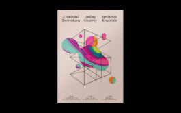
Some designers don’t make. Some makers don’t design. Donut Shop Design knows how to do both, and bridges a gap that unleashes new creative potential.
Project: Visual Identity
Client: Donut Shop Design
Country: USA
Year: 2023–2024
The catalog for Spain, the guest of honor at the Frankfurt Book Fair 2022 is not just a book, it is an artifact. With its special inks, the open spine binding, the color threads and sparkling cover paper, the catalog is an object that endures long after the fair has ended.
Project: Spain, Guest of Honour of the Frankfurt Bookfair 2022
Client: Spanish Ministry of Culture and Sports
Country: Spain
Year: 2021–2022
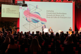
TwoPoints.Net developed the concept, claim, images and animations for the Visual Identity of Spain, Guest of Honour of the Frankfurt Bookfair 2022 and has supervised its application since 2021, as well as designed key deliverables.
Project: Spain, Guest of Honour of the Frankfurt Bookfair 2022
Client: Spanish Ministry of Culture and Sports
Country: Spain
Year: 2021–2022
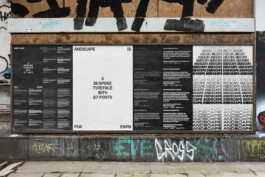
Andscape is a Black-led media platform dedicated to creating, highlighting, and uplifting the diverse stories of Black identity. TPN was commissioned by ESPN to design an exclusive bespoke typeface with 27 fonts.
Project: Andscape
Client: ESPN
Country: USA
Year: 2022
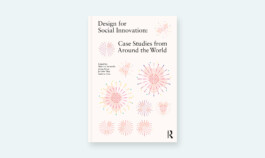
The United Nations, Australia Post, and governments in the UK, Finland, Taiwan, France, Brazil, and Israel are just a few of the organizations and groups utilizing design to drive social change. Grounded by a global survey in sectors as diverse as public health, urban planning, economic development, education, humanitarian response, cultural heritage, and civil rights, Design For Social Innovation captures these stories and more through 45 richly illustrated case studies from six continents.
From advocating to understanding and everything in between, these cases demonstrate how designers shape new products, services, and systems while transforming organizations and supporting individual growth.
Project: Design for Social Innovation
Country: USA
Year: 2021
Hype Hits is a new music brand from ESPN, representing the best of music and sports. Hype Hits are the songs playing in stadiums, locker rooms, buses, and headphones, getting athletes and fans ready. ESPN commissioned TwoPoints to design the assets (two fonts in three styles, patterns, pictograms and layouts) which they would use to build all the deliverables.
Project: Hype Hits
Client: ESPN
Country: USA
Year: 2021
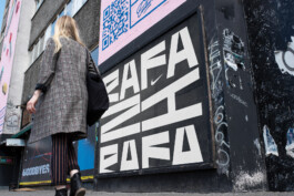
Rafa Nadal won his 21st Grand Slam in the beginning of 2022. To celebrate this huge achievement NIKE commissioned TPN to design a lettering. None of the proposals ended up being used, which does not make TPN love them less.
Project: Rafa 21
Client: NIKE
Country: Netherlands
Year: 2021
Shapeshifting across disciplines, «Macchina Inutile» is a flexible visual system designed for HOLO, the editorial and curatorial platform, exploring disciplinary interstices and entangled knowledge as epicentres of critical creative practice, radical imagination, research, and activism.
Project: Visual Identity HOLO
Client: HOLO
Country: Canada
Year: 2020
The Center for Complexity is a platform for transdisciplinary collaboration and innovation, informed by global events and creative practices, founded to benefit scholars, practitioners, a diverse range of partners, and the RISD community.
Project: Center for Complexity
Client: Rhode Island School of Design
Country: USA
Year: 2018–2020
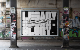
We had the pleasure to design some type for NIKE. Along with three different fonts, we designed proposals for the retail design and campaign for the new NIKE shop at the Chelsea Football Club Stadium.
Project: NIKE CFC
Client: NIKE Europe
Country: Netherlands
Year: 2020
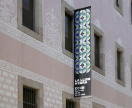
Black Light was an exhibition about the influence that various secret traditions have had on contemporary art from the nineteen-fifties to the present day. It presented around 350 works by artists such as Antoni Tàpies, Agnes Martin, Henri Michaux, Joseph Beuys, Ulla von Brandenburg, William S. Burroughs, Joan Jonas, Jordan Belson, Goshka Macuga, Kenneth Anger, Rudolf Steiner, Alejandro Jodorowsky, Francesco Clemente and Zush.
Project: Black Light
Client: CCCB
Country: Spain
Year: 2018
TPN had the honor to design this years edition of Barcelona’s Long Night of the Museums, which contains a multitude of items such as big and small banners, city light and storefront posters, busses, public screens, flyers and brochures, spread all over town!
Project: Long Night of the Museums
Client: Institut de Cultura de Barcelona
Country: Spain
Year: 2019
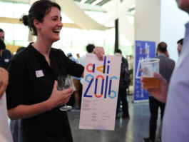
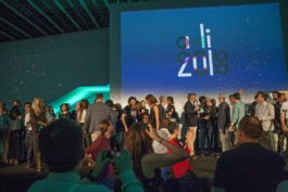
You probably have seen the visual identity we developed for the ADI Awards, the biggest Spanish award for culture, industrial and product design. If you have not, have a look here. For the 2018 edition we made a little revision.
Project: ADI Awards
Client: ADI-FAD
Country: Spain
Year: 2018
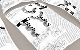
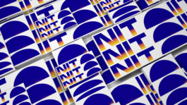
We designed a font with two different width for the NEXT section. Every year since 1998, ESPN The Magazine has recognized an elite group of emerging athletes to watch in the year ahead. ESPN calls these athletes NEXT.
Project: ESPN Next
Client: ESPN The Magazine
Country: USA
Year: 2019
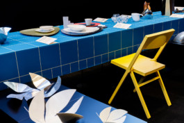
The exhibition “Small designs, great architects” at the Roca Gallery Barcelona shows domestic objects, designed by renowned architects such as Peter Zumthor, Toyo Ito, David Chipperfield, Zaha Hadid and Jean Nouvel.
Project: Small Designs, Big Architects
Client: Roca Gallery Barcelona
Country: Spain
Year: 2019
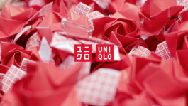
UNIQLO Barcelona commissioned TwoPoints.Net to design a campaign for Sant Jordi.
Project: Sant Jordi
Client: UNIQLO
Country: Spain
Year: 2018
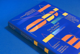
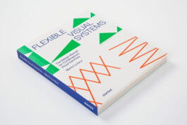
Typography has become more exciting than ever. While the legacies of classical typographers will always be respected and revered, recent developments have paved the way for a new generation of digitally-savvy creatives to explore and experiment with an eye-opening range of possibilities. Variable fonts, kinetic typography, format- and content-responsive design, typography in augmented reality and interactive typographic installations are just a couple of new fields. The future of typography is becoming more and more flexible.
“On the Road to Variable: The Flexible Future of Typography” was curated and written by TwoPoints.Net and published by Viction:ary. It contains an extensive introduction, insightful interviews with Mitch Paone (DIA) and Felix Pfäffli (Studio Feixen) and 122 inspiring typographic works by 62 brilliant design studios from all over the world.
Project: On the Road to Variable
Client: Viction:ary
Country: China
Year: 2019
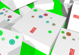
TPN was commissioned by the japanese clothing brand UNIQLO to develop a system to modify their existing packaging and space for Xmas. Based on one simple grid and three neon colors, TPN designed 135 snowflake-stickers.
Project: UNIQLO XMas
Client: UNIQLO
Country: Spain
Year: 2017
TPN developed the campaign "Plan de Fomento de la Lectura 2017–2020" for the Spanish Ministry of Education, Culture and Sports.
Project: Vidas Extra
Client: Ministery of Culture, Education and Sport
Country: Spain
Year: 2017
When developing the corporate identity for the New York City architecture firm Dash Marshall TPN realised that their architecture acts in the intersection of the old and the new, the static and the flexible, the properties of matter and the lives of people. Within these constraints Dash Marshall creates spaces which tell the stories of their habitants and invites them to create new ones.
Project: Dash Marshall
Client: Dash Marshall
Country: USA
Year: 2017
TPN developed a visual identity for the publication Leap Dialogues and it’s marketing tools, website, poster, postcard, e-flyer and newsletter.
Project: Leap Dialogues
Client: Design Matters, ArtCenter College of Design
Country: USA
Year: 2017
TPN was not just commissioned to create a new symbol for the new ADI award ADI Culture, but also a coherent visual system for all three awards, which would make the constant redesign of the symbols for each new edition unnecessary.
Project: ADI Awards
Client: ADI–FAD
Country: Spain
Year: 2015–2018
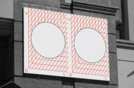
For the Vertical Geopolitics Lab a multi-layered and multi-aesthetic flexible visual identity has been the most appropriate visual language.
Project: Vertical Geopolitics Lab
Client: Vertical Geopolitics Lab
Country: Switzerland
Year: 2016–2018
