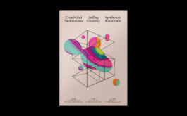
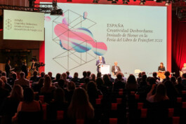
We usually do not name our visual systems, but in this case it felt appropriate to call it the «Macchina Inutile».*
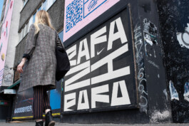
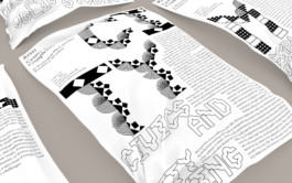
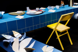
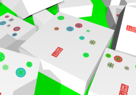
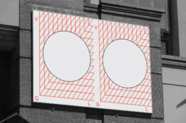
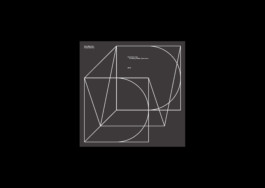
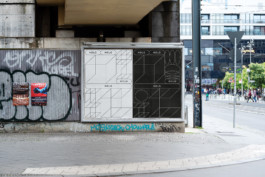
The visual system for HOLO is not a visual identity and it is most certainly not a logo, although it exercises both functions to an extent. It is a useless machine, an uninhabitable building, a toolkit to build mind palaces in multiple dimensions. As an editorial and curatorial platform, HOLO explores disciplinary interstices and entangled knowledge as epicentres of critical creative practice, radical imagination, research, and activism. Shapeshifting across disciplines, «Macchina Inutile» is a flexible visual system distributed randomly over HOLO’s platform, building in their entirety an imaginative building.
Design: TwoPoints.Net
Client: HOLO
* A useless machine, sometimes known as a "useless box", is a device which has a function but no direct purpose. It may be intended to make a philosophical point, as an amusing engineering "hack", or as an intellectual joke. Devices which have no function or which malfunction are not considered to be "useless machines". Wikipedia
The secret of a successful visual system is not just the visual system itself, but how easy it is to apply. In order to give HOLO more flexibility to resize and recolor the elements, we designed a webfont with the elements. We are planning to substitute elements in the future and let the visual system evolve in time. Only having to update the font is probably the easiest form of implementing changes.

Implementing a font and not images makes it as well easier to switch in between light and dark mode.




More Projects:
